
We may receive a commission on purchases made from links.
Once we’ve seen them come to life onscreen, it can be difficult to even imagine characters any other way, but in reality, many well-known figures in pop culture were almost unrecognizable in their initial versions. From concept art to casting, essential elements of many beloved films nearly took on completely different forms.
Due to reasons such as creative disagreements, extended development periods, technological advancements, story revisions, or even the outcomes of test marketing, the creation process for some of the most iconic characters in film and television has often been complex, filled with unexpected twists and happy accidents. If the final appearance hadn’t turned out as it did, some of these instantly recognizable characters might have quickly faded into obscurity. Let’s explore what could have been.
Ursula (The Little Mermaid)
Take, for example, Ursula the sea witch from 1989’s “The Little Mermaid,” one of Disney’s most memorable villains. Her tentacles gliding through the water and her skin’s purplish undead hue make her unsettling without being too frightening for a family-friendly film. However, she was initially intended to resemble a lionfish, complete with numerous protruding fins.
In some concept drawings, she looks like a busybody with a bad wig; in others, she looks like she’s about to be cast for “Real Housewives of the Sea.” Though animators tried many variations on the lionfish theme, nothing seemed to work until they switched over to the idea of giving her the body of an octopus. Another fun fact about Ursula: her now-classic look was inspired by the drag queen Divine. Who knew “The Little Mermaid” and “Pink Flamingos” had so much in common?
Russ Cargill (The Simpsons Movie)
Russ Cargill, voiced by Albert Brooks, was the only original character created for 2007’s “The Simpsons Movie” — and the creative team didn’t have an easy time finding a villain to fit in properly with the franchise’s beloved characters. Originally, Cargill was an older, balding EPA agent with a bit of a tummy and a penchant for sweaters—a little closer to Gil from the TV show than the fast-talking government worker that ended up in the film. Very late in the animation process, the team changed him to match the energy of the movie.
The last-minute switch wasn’t perfect. The movie already had a Burger King tie-in, and they’d sent out their character designs before they realized Cargill would get a makeover. Any kid wanting a toy of the newest Simpsons character had to settle for the original design. Watch the deleted scenes and commentary track on “The Simpsons Movie” DVD, and you can hear more about Cargill’s evolution and see a little of the old Russ in action.
Arthur Read (Arthur)
Once upon a time, Arthur wasn’t just a meme — he was the star of a series of children’s books and a lovely PBS show. If you’ve ever wondered why Arthur the Aardvark doesn’t look anything like an aardvark (or any other animal, honestly), it’s all because of author Marc Brown, who’s evolved Arthur’s look over time.
In 1976, the little guy looked more like an aardvark with a long nose and a sad look in his eyes. As Brown detailed in his blog, he gradually drew the character with a more human appearance, feeling it was more relatable to kids. Would the Arthur’s fist meme have taken off with the original drawing? We’ll never know.
Batman
Bob Kane and Bill Finger are Batman’s credited creators, but Frank D. Foster II claims he’s the one who really did the honors. Foster described where the idea came from in a 1975 interview with an attorney (via Original Batman), recalling, “In those days, and even now, most of the strips were the heroes of the day … flying through the sky during the day and doing good deeds and so forth and so on — and I thought, well, why couldn’t that be done at night? Have a good guy do stuff at night.“
Foster claimed he drew up the first rendition of Batman and had meetings with DC Comics in 1937 to discuss some of his ideas, after which he left his original concept drawings with the company. According to Foster, DC returned the drawings to him, saying they wouldn’t be going with his work. Batman made his 1937 debut in “Detective Comics #27.” Foster never sued because he didn’t have the means, leaving a chapter from the creation of the Dark Knight forever shrouded in mystery.
Elsa (Frozen)
Disney had to go through a lot before they could get to “Let it Go.” Before she reached the screen in Disney’s smash hit “Frozen,” Arendelle’s ice-powered Princess Elsa (Idina Menzel) went through a number of incarnations.
First she was supposed to be a villain with a heart of ice after being left at the altar. This version hewed slightly closer to the story that inspired the film, Hans Christian Andersen’s “The Snow Queen.” Original concept art based Elsa on Bette Midler, and Megan Mullally was slated to give the villain her voice. Eventually, the studio changed course—and had the biggest hit they’ve had in years, grossing over a billion dollars worldwide.
Buzz Lightyear (Toy Story)
If “Toy Story” had been released with its original characters and story, Pixar might not even exist today. The first version imagined Woody as a big ventriloquist’s doll, who was promptly changed to stuffed cowboy, probably because ventriloquist dolls are always creepy. Concept art showed Buzz to be a more clean-cut, ’50s-looking astronaut type with less heart and personality. Still, Woody was much bigger than Buzz – and a much bigger jerk.
According to an interview in Black Friday: The Toy Story You Never Saw, director John Lasseter wanted the movie to be edgy and a little dark. But when he viewed the first half of the film, he knew it was terrible; as he put it, “It was a story filled with the most unhappy, mean people.” The Pixar guys only had two weeks to try to make the story work … and the rest was animation history.
Kermit the Frog (The Muppets)
Another example of an original character being a real jerk, Kermit the Frog first appeared — with a very different temperament — long before Miss Piggy and the rest of the Muppets gang. Hired to create ads for Wilkins Coffee, Muppets creator Jim Henson used a proto-Kermit and another puppet to make a series of comical commercials.
That picture above on the left? That’s Kermit flipping the switch on an electric chair. The other Muppet didn’t drink Wilkins, so he had to go. All the ads feature Kermit committing murder, or at least bodily harm. Thankfully, as time wore on, Henson kept Kermit’s voice the same but added a little humanity to the formerly sociopathic frog.
The Wicked Witch of the West (The Wizard of Oz)
Margaret Hamilton’s version of the Wicked Witch of the West in “The Wizard of Oz” is one of the most memorable villains of all time; even today, she’s responsible for increased sales of green facepaint around Halloween. But author Frank L. Baum pictured the witch differently.
She didn’t have green skin for one, but she did have three pigtails. (Just because you’re a witch doesn’t mean you can’t have fun with your hair.) She was a squat older woman with an improbably huge hat and a skirt with moons and frogs on it — basically, she looked more like a quirky middle school art teacher than the embodiment of wickedness. Baum also said the witch only had one eye, which some illustrators portrayed by having her wear an eyepatch or by simply having a cyclops eyeball in the middle of her forehead. Lastly, the witch of the books never carried a broom; instead, she wielded an umbrella. (Maybe that means Mary Poppins is actually a witch?)
Regardless of how far it fell from Baum’s original vision, the simple green skin, crooked nose, and black hat seen in the film version of the Witch has become iconic in a way an umbrella-wielding old lady with a frog dress could never hope to achieve.
Yautja (Predator)
The Predator is easily one of the most recognizable movie monsters of the 20th century, but it almost looked completely different. Initially, the person cast to play the character was none other than Jean-Claude Van Damme, and a costume was created for his use. The creature was lankier, requiring leg extensions and an additional leg joint. This looked good in mock-ups, but made it almost impossible for JCVD to do any kind of expressive acting.
Moreover, it couldn’t move as planned and was incapable of operating in the on-location jungle environment. JCVD thought he’d be able to show off his moves, but was too restricted and absolutely hated the suit, with no love especially for the head. He walked from the project, and production came to a halt so a new design could be made. For this, they brought in legendary special effects artist Stan Winston, who’d previously designed the T-800 for “The Terminator.”
Winston took a different approach to the design by factoring in the necessary movements and the environment in which the suit would need to function for its new occupant, Kevin Peter Hall. The pressure was on, and time was a factor, as every day that production was delayed was costly. Winston and his team came up with the design that made it into the movie, and a new fearsome creature earned an indelible place in pop culture.
Xenomorph (Alien)
Of all the frightening monsters dreamed up for the movies, perhaps none are as terror-inducing as the Xenomorph from the “Alien” franchise. Because the film is more horror than sci-fi, the creature doesn’t take up too much screen time, remaining largely in the shadows as it’s slowly revealed –an approach that worked well in “Jaws,” and did the same for “Alien.” But since it is the focus of the film, the monster still had to be terrifying.
Pre-production resulted in several unusual designs before anyone thought to snag the help of Swiss artist H.R. Giger. Many of these were laughably bad, but the worst of the bunch came when Robert Aldrich, who was initially tapped to direct, had an idea. Producer Walter Hill explained during an appearance on the “WTF with Marc Maron” podcast that Aldrich had a plan, and he knew that the film would fail or succeed on the creature.
Aldrich told him, “We’ve gotta come up with something really unique. … just off the top of my head … maybe we could get, like an orangutan and shave it — train the son of a b****; you shouldn’t see it very much.” Fortunately, the idea never gained traction, and Giger came in to deliver one of cinema’s greatest monsters. Giger’s version initially included a Xenomorph with eyes, but this too was abandoned for the final design.
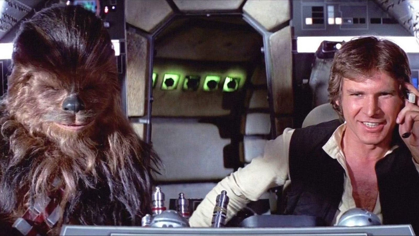
Han Solo and Chewbacca (Star Wars)
Director George Lucas’ initial plans for “Star Wars” were so different from the film that they look almost nothing alike. To realize his vision, Lucas brought in renowned artist Ralph McQuarrie to flesh out the look of everything, from planets and weapons to characters and ships. Many of McQuarrie’s designs were used, while others were slightly modified.
One that didn’t make it into the 1977 film was the design for Chewbacca. The character is based on Lucas’ dog, Indiana, and McQuarrie’s concept art skewed in that direction. Unfortunately, McQuarrie’s idea was not the lovable, fur-covered behemoth co-pilot that Peter Mayhew brought to life as the Chewbacca we all know and love. He looked more frightening, with massive eyes, an indiscernible nose, and a smaller mouth. His ears also jutted out of the sides of his head, and he carried a blaster and wore armor.
Lucas conceived of an entirely different plan for Han Solo, as he imagined him to be a slime-covered, green-skinned alien called a Yourellian. This was laid out in Lucas’ 1974 rough draft, which bore little resemblance to the finished film. While neither design was used in “Star Wars: Episode IV — A New Hope,” both have been featured in the franchise. The comic series “The Star Wars” is based on Lucas’ rough draft, while McQuarrie’s Chewie design helped inspire the look of “Rebels” character Zeb Orrelios.
Dorothy Gale (The Wizard of Oz)
Dorothy Gale (Judy Garland) from “The Wizard of Oz” is one of cinema’s most beloved characters. The film has been a mainstay of popular culture since it helped usher in the age of Technicolor in 1939, and while there have been sequels, remakes, and a ton of adaptations, the gravitas of Garland’s version is undeniable. She boasts a simple yet iconic look, wearing a blue dress, white top, and braided pigtails held together with blue ribbons as her reddish-brown locks gorgeously frame her face.
The look is important because the initial plan had several differences in mind that make the character almost unrecognizable. She was covered with heavy makeup and made to look more glamorous than a young Kansas girl in the 1930s would appear. That and a blonde wig were chosen for Dorothy, and that’s how they began shooting the film in 1938.
When production stalled due to an on-set injury and a casting change, Dorothy’s look didn’t last. A new director, George Cukor, was brought in for the interim, and he decided Dorothy needed to look less like a movie star and more like a Kansas farm girl. Cukor tossed the blonde wig, removed much of the makeup, and let Garland’s hair go au naturel. The film would likely have succeeded without the change, but it’s hard to imagine Dorothy blonde and all gussied up.
Gaston (Beauty and the Beast)
The main focus in “Beauty and the Beast” is on the characters described in the film’s title, but the villain is decidedly Gaston (voiced by Richard White). He pursues Belle (Paige O’Hara) despite her complete lack of interest, and this pushes him to confront the Beast (Robby Benson), leading to Gaston’s inevitable demise. In the film, Gaston is a burly, outdoorsy, vainglorious man who cares for nothing but himself, and he sees Belle as a possession, not a woman he needs to woo.
The 1991 film is based on an 18th-century French fairy tale, which inspired the look of the characters. This was especially true of Gaston, who has a dark history, but looked like an 18th century French aristocrat when artist Andreas Deja began developing the character. In a blog post, Deja explained, “Gaston was already vain and full of himself, but not like the outdoorsy type from the final film. This guy lived the good life. He wore expensive clothes, had servants, and never worked a day in his life. He sort of looks like a young Marlon Brando.”
The original Gaston wore a white powdered wig, blue coat, and other typical trappings of the day. This look was abandoned during production, and the animators went with the Gaston seen in the film. Deja’s initial concept was more true to the fairy tale than what followed, but Gaston’s appearance undeniably works in the movie.
Ellen Ripley (Alien)
Throughout much of the 20th century, action films were dominated by leading men, not women. When it came time to develop the script for “Alien,” the plan was to make the Ripley character a man. This probably would have worked, but by changing the character to a woman, the film created one of the strongest female protagonists in all of science fiction. Sigourney Weaver’s Ellen Ripley is resilient, smart, unwavering in her resolve, and ultimately the hero of the movie.
Director Ridley Scott explained to the Los Angeles Times (via CBR) that he’d initially planned for Ripley to be a man. “I think the idea actually came from [then president of 20th Century Fox] Alan Ladd Jr.,” Scott said. “I think it was Ladd who said, ‘Why can’t Ripley be a woman?’ And there was a long pause, that at that moment, I never thought about it. I thought, ‘Why not? It’s a fresh direction’ … And away we went.”
Part of what made “Alien” such a compelling film when it was released in 1979 was that the main character was a woman. It’s not that such a thing was unheard of, but female leads in the ’70s were often limited to Blaxploitation or romantic comedies. Sci-fi was a bit different: Princess Leia (Carrie Fisher) from “Star Wars” helped pave the way for Ripley, making female action heroes more commonplace.
Genie (Aladdin)
Designing characters for any Disney animated film is a daunting process, and the artists and animators who created “Aladdin” went through many versions as they developed the movie’s many memorable characters. Perhaps the one who went through the most changes as he was developed was the Genie (Robin Williams), who cycled through several unusual designs. In one, the Genie is green and kind of overweight, without the comical appearance that made it into the final film.
Another version of the green Genie included no facial hair, a small ponytail, and what can only be described as a diaper. These designs might have been home in a Disney film like “The Black Cauldron,” but not the tentpole that was “Aladdin” in 1992. Another design included horns, a feathered hat, a Van Dyke beard without the mustache, and clawed fingers. While still quite different, that look is the most similar to the one in the movie.
The first designs for the Genie were created by Eric Goldberg, who joined the production in September 1990. His initial efforts were also different, as he put it in the “Aladdin Artbook”: “I designed him, basically as a swirl of smoke with a nose and eyes.” That’s not a lot of expressive material for Williams to work with, so it’s a good thing they conceived of the much friendlier-looking blue Genie that the animators ultimately went with in “Aladdin.”
Snow White (Snow White and the Seven Dwarfs)
“Snow White and the Seven Dwarfs” was something of a gamble for Walt Disney, as it was his first feature-length animated film. There was no way to know if it would work, and the movie required a huge investment in time and resources, which included developing the characters. But Disney and his animators didn’t create Snow White from thin air, as the story for the 1937 movie is adapted from the 1812 Brothers Grimm fairy tale, simply called “Snow White.”
This gave the artists a template of what the characters should look like, but the initial designs didn’t work for Disney. Snow White was a challenge because animating a human woman wasn’t something Disney’s animators had experience with. The first designs were more cartoonish, featuring enlarged eyes and smaller features, making her look more like Olive Oil than Snow White.
Hair was also a concern, as some drawings feature red and blonde hair in a variety of styles. A more detailed depiction by Grim Natwick bore many of the features used in the final product, but Disney felt that she gave off too much of a Betty Boop vibe and looked too provocative. So the animators used 14-year-old Marjorie Champion as a guide and came up with Snow White’s final look, as seen in the movie.
Richard (The Amazing World of Gumball)

Turner Entertainment Networks International Limited/Ben Bocquelet/Cartoon Network
“The Amazing World of Gumball” is among the best Cartoon Network shows of all time and widely respected for using a variety of animation styles mixed with live-action in its design. Each frame is a work of art, and the characters are cute, expressive, and well thought-out.
One of the main characters, Richard Watterson, may not be the brightest bulb, but he’s a loving father who works hard to care for his family — and has the appearance of an adorable pink rabbit. This was not the original concept Ben Bocquelet developed for Richard when he was putting “The Amazing World of Gumball” together. His original plan was for Richard to be a blue dog with a much thinner frame, and in some sketches, he wears glasses. The dog version of Richard has long, droopy ears and stubble akin to someone like Homer Simpson. There is very little about the dog character that resembles Richard, outside of wearing a collared shirt and tie.
It’s unclear why Bocquelet abandoned the blue dog approach to the character, but given how different they are, it’s hard to imagine swapping the designs. The viewers agree, as one fan posted on “The Amazing World of Gumball” Fandom page, “I think if we had Richard as [a] blue dog, it would be [a] completely different character [than] we know him today.”
Maui (Moana)
Sometimes, a small change to a character’s depiction can make all the difference, and this is especially true of Maui from “Moana.” The character is voiced by Dwayne Johnson, and the original concept sketches for Maui had him looking a bit like the voice actor. He’s bald and has tattoos all over his body. Johnson doesn’t have as many tattoos, but there’s no denying there’s at least a passing resemblance between the character and the person who voices him in the movie.
Many versions of Maui incorporated various Polynesian traits, including the style of earrings, necklaces, and clothing. He wore a necklace made of shark teeth in one drawing, which made it into the film. Still, the most notable differences are the shape of Maui’s face, which is rounder in the movie, and his hair, which is long, curly, and glorious.
The hair was added later, and he even dons a topknot in a few scenes, making it a big part of his look in the film. Ironically, while Johnson also plays Maui in the live-action adaptation of “Moana,” he’ll have to wear a large and likely cumbersome wig so he looks more like the character’s final design. Had they stuck with the hairless Maui, Johnson could get away with merely showing up, ditching his clothes for a grass skirt, and he’d be good to go.
WALL-E (WALL-E)
While the animators for 2008’s “WALL-E” did an amazing job of reimagining the world as a barren landscape inundated with garbage, the film’s success rested on its lead. WALL-E is one of the most expressive and evocative characters in all of animation, and this is accomplished, not through words, but through movement. The manner in which he expresses emotion is mostly related to his eyes, which evoke everything from amusement and love to terror and incredulity.
Pixar movies go through a lot of design changes before animation begins, and this was certainly true of “WALL-E” and its characters. Various options arose that related to WALL-E’s trash management function. In one drawing, he looks a bit too much like a trash can with eyes, while in others, he doesn’t look like he could emote anything whatsoever. The focus ultimately fell on the character’s eyes, which director and lead creative artist Andrew Stanton developed for quite some time to get just right.
WALL-E became an empathetic character because of the artists’ dedication to their craft. The concept art didn’t come close to what the artists achieved by streamlining WALL-E’s appearance into something viewers could empathize with on a truly emotional level. Try to imagine watching the film with the character pictured on the left, and you can see how such a design wouldn’t have worked.
Timon and Pumbaa (The Lion King)
“The Lion King” is an adaptation of William Shakespeare’s “Hamlet,” incorporating many of the same characters reimagined as animals. For example, Timon and Pumbaa take on the roles of Rosencrantz and Guildenstern, functioning as the film’s comic relief. Granted, the animators and writers had some fun bringing these characters to life in warthog and meerkat forms, and both characters are some of the most beloved from the franchise.
While the CGI adaptation released in 2019 favored more realistic animals, the 1994 animated classic did not. The creatures in “The Lion King” are more cartoonish, having more exaggerated features, but this wasn’t always the case. During the design phase of the film, many options were considered, including more realistic depictions of animals. Timon and Pumbaa initially looked just like a warthog and a meerkat, which was probably the point.
As the film developed, this notion was scrapped for the more cartoonish characters seen in the film. Some elements remained, including the general sizes of the pair and the fact that Timon can stink up the Serengeti. Still, some drawings make him look more akin to Eeyore from “Winnie the Pooh” than a proper warthog, so it’s probably for the best that these ideas were tossed out. Timon’s appearance didn’t change much outside of shortening his snout and giving him more expressive eyes.
Hades (Hercules)
The animators who brought Disney’s “Hercules” to life on the silver screen in 1997 modeled their artwork off ancient Greek illustrations, so it has a completely different look when compared to the studio’s other films. This works well in the final product, and the characters are well-designed. Of course, it took time to flesh everyone out, and it appears that the one character whose appearance was the most difficult to finalize was Hades, voiced by James Woods.
The final representation depicts the God of the Underworld with blue skin and flames for hair. The fiery locks help to express emotions, and when Hades is angry, he literally blows his top. This wouldn’t have been possible with the various concepts that arose during character development. As revealed in “The Art of Hercules — The Chaos of Creation” art book, Hades was initially conceived as an effeminate version of the classic Satan look from Christian mythology.
Another attempt at designing Hades included the flaming hair, but made him look more like a stick figure who might have appeared on the sides of a Grecian urn. Other unusual designs included a different appearance for Cerberus, the three-headed hound who guards the Underworld, while some of the monsters in the movie look nothing like the original drawings. But Hades may be the one character from “Hercules” who bears the least resemblance to the original vision.
E.T. (E.T. the Extra-Terrestrial)
“E.T. the Extra-Terrestrial” is a beloved family classic, but it didn’t start out that way. Initially, director Steven Spielberg wanted to do a sequel to “Close Encounters of the Third Kind,” only as a horror movie. He developed this film under the working title of “Night Skies,” but ultimately scrapped the idea in favor of the film he released in 1982. Before that happened, however, Spielberg worked with legendary SFX artist Rick Baker on the alien’s design.
Baker crafted some truly terrifying creatures, which wouldn’t have been welcome in the final film. Many of Baker’s ideas eventually did make it into various projects, and his work still influenced the creation of E.T. Meanwhile, Spielberg hired Ed Verreaux to work out the design of the character, offering an idea in the form of pictures of babies with Albert Einstein’s and poet Carl Sandburg’s eyes pasted onto their faces. Verreaux used the idea and drew several concept sketches.
Some elements of Baker’s designs remained, including the glowing fingertips, large eyes, and extended neck. Spielberg wanted a character who wouldn’t frighten children, so it took some effort to finalize the look of the alien. Baker shared his designs on X, formerly Twitter, and while you can see similarities, it’s hard to imagine Drew Barrymore not screaming much louder had she encountered the beastie pictured on the left.
Darth Maul (Star Wars: Episode I — The Phantom Menace)
The “Star Wars” saga features some impressive character designs, including Darth Maul, played by Ray Park in 1999’s “Episode I — The Phantom Menace.” Frightening doesn’t begin to describe the hooded figure who boasts a crown of horns, red and yellow eyes, and symmetrical red and black facial markings. Maul is a truly great, menacing character to behold, but he almost looked much different.
Director George Lucas worked with concept artist Iain McCaig to flesh out the character’s look. He provided McCaig with the script, which called for “a vision from your worst nightmare.” When he presented his original design for Darth Maul to the director, Lucas was terrified and slammed the book shut. He told McCaig (via StarWars.com), “Give me your second worst nightmare,” resulting in the appearance that made it into the film. It’s easy to see where Lucas was coming from, because McCaig’s original design is horrifying to look upon.
Maul is pictured with whitish-blue skin and red dreadlocks. His eyes are sunken in and black, though they reflect a small bit of light to the observer. McCaig’s version might have worked, but Maul would probably be a footnote in the franchise instead of one of the best-looking characters to appear in “Star Wars.” Fans loved Maul so much that he was brought back from the dead, but it’s unlikely anyone would want to see the ugly mug pictured on the left more than once.