For generations, it has been a familiar sight in classrooms around the world. Now, however, the traditional world map could be heading for a major redesign.
The possibility follows a United Nations vote supporting the replacement of the map many people first encountered at school with a version that gives Africa a considerably larger presence.
The proposal has triggered a diplomatic dispute over whether it represents a serious effort to portray the world more accurately—or another example of politically driven “wokery”.
The debate can be traced back to 1569, when Flemish cartographer Gerardus Mercator created his original map to help European explorers navigate the oceans.
Mercator’s projection was highly effective for navigation, but it did not provide a true picture of the world’s land masses.
The problem stems from the shape of the Earth. Because the planet is spherical, geometry makes it impossible to reproduce a globe accurately on a flat, two-dimensional map.
To account for the planet’s curvature, Mercator’s projection makes countries near the Equator appear smaller, while enlarging those closer to the North Pole.
As a result, Africa appears to be approximately the same size as Greenland, even though the African continent is actually about 14 times larger.

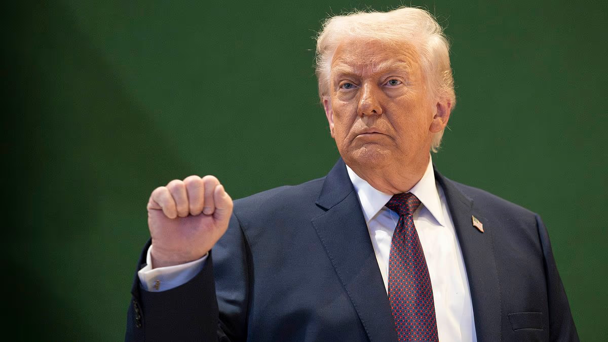
Some observers believe Trump’s fixation with Greenland is partly influenced by the map’s exaggerated impression of its size

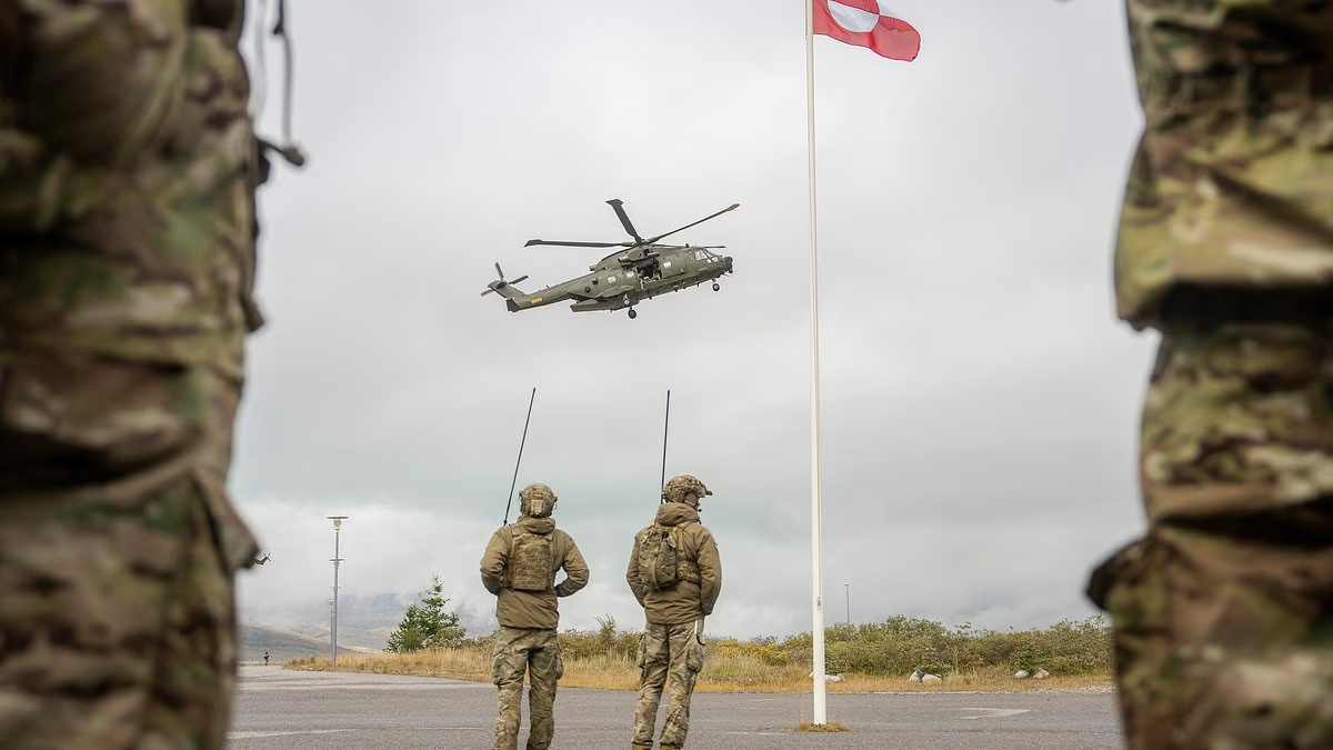
The Greenland flag flies above the rugged landscape of the capital, Nuuk
Despite these distortions, the geometric features of the Mercator projection were welcomed in Victorian Britain. With northern territories such as Canada marked in vivid red or pink, the map helped make the British Empire appear even more extensive.
Britain’s placement near the centre of the map reinforced that impression. It was initially linked to the country’s maritime power and later strengthened by the creation of the Greenwich Prime Meridian.
Questions about Mercator’s projection began to grow in the late 19th century, as maps and atlases became more accessible. Public understanding of world geography and the relative scale of different land masses was also improving.
A stronger backlash emerged in the 1970s, when critics argued that the projection understated both the development needs and economic potential of Third World nations. Some went so far as to call it an example of “cartographic colonialism”.
By the beginning of the 21st century, the issue had reached mainstream television drama. In a 2001 episode of The West Wing, the NBC series about the US presidency, a representative of the fictional Organization of Cartographers for Social Equality met presidential press secretary CJ Cregg, played by Allison Janney.
According to a West Wing fan site, the group ‘felt strongly that traditional Mercator maps gave undue focus on the nations and people of the northern hemisphere’.
Nor does the White House connection end there. Some observers say Donald Trump’s obsession with Greenland, understood to be largely based on its strategic military location, is at least partly inspired by his belief that it’s a much bigger country than it actually is.
By 2018, a group of cartographers had produced a new map called the Equal Earth projection – which has since been used by Nasa. It was adopted in February this year by the 54 member states of the African Union on the grounds that it ‘more accurately represents the sizes of all continents, particularly Africa’.

Greenland and Antarctica are smaller than Africa, but the the centuries-old Mercator map shows them to be unrealistically larger

The UN has voted to replace the Mercator map with the Equal Earth projection
According to the Correct The Map campaign – set up by African lobby groups in favour of the Equal Earth model – it would be possible to ‘fit the United States, China, India, Japan, Mexico and much of Europe into Africa and still have land to spare’.
Yet while the campaign warns that ‘we have based our understanding of Africa, and the world, on a map that is wrong’ for more than four centuries, there is also a strong political undertone. ‘The Mercator map isn’t just about misrepresenting the size of the global south, it’s about power and perception,’ it says.
According to Lerato Mogoatlhe – from Africa No Filter, one of the groups involved – the campaign is part of a drive to stop the ‘world’s longest misinformation and disinformation’ about Africa.
She told the BBC: ‘Africa’s misrepresentation on world maps is not just a cartographic error, it’s a narrative issue.’
Kenyan geographer Kioko Muendo agrees: ‘Maps are more than just guides for travellers, they shape how regions are perceived politically and economically.’
At a meeting of the UN General Assembly in New York on September 4, member nations debated whether to adopt a Correct The Map resolution which described dropping the Mercator design as an act of ‘cognitive justice and memorial reparation’. Togo’s foreign minister Robert Dussey was one of the diplomats who argued for the change.
‘A fair world begins with a fair map,’ he said. ‘A map is never neutral. It shapes perceptions, influences how the place of peoples and continents in the world is understood.’
But US representative Yaryna Ferencevych was having none of it. In a damning volley of remarks, she told the hearing: ‘Instead of focusing on genuine problems of international peace, prosperity or good relations, this body is debating map projects from the 16th century and their role in promoting reparations and “cognitive justice”’.
Describing it as part of ‘a much larger and more radical ideological project’, she said: ‘This resolution mocks the work and purpose of this institution.’
Ms Ferencevych, a member of the US Senior Foreign Service, who has previously been posted to embassies in Afghanistan, Iraq and the UK, added: ‘Resolutions like this and the ideological agenda they promote are like barnacles on our work here.’
Despite her reservations, the motion was carried by a wide margin, with the UK among the 164 member states voting in support, while six abstained and one – America – voted against.
In a statement published on its website after the result was declared, the UN said: ‘The resolution does not ban the Mercator projection or impose a replacement. Instead it encourages governments, schools, international organisations and technology companies to use the Equal Earth projection and other so-called equal-area maps when relative size matters, and teach the limitations of any flat map in representing a spherical planet.’
It added: ‘Behind that seemingly technical debate lies a larger argument about history and power: whether a map designed for European sailors in the 16th century has, over generations, distorted not only geography but perceptions of a whole, vast and complex continent.’
None of this will convince anyone at the Trump White House, of course. The maps on the wall of the Oval Office are unlikely to be changed any time soon.
And President Trump will presumably continue to believe that Greenland covers far more terrain than it actually does.