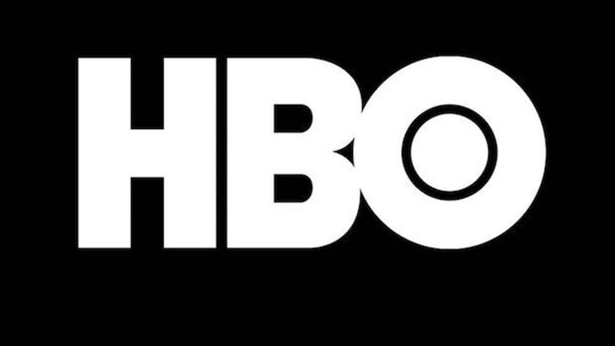

The iconic HBO logo has seen numerous changes since the network’s launch in 1972. However, observant fans have recently noted two prominent ‘flaws’ in the latest design.
On social media, users have highlighted that the letter ‘B’ appears to sit slightly lower than the ‘H,’ while the ‘O’ seems positioned higher.
At first glance, these discrepancies might seem negligible, but once noticed, they become hard to ignore.
James Barnard, who is a logo designer, addressed people’s observations and picked apart the current logo in a video he posted to Instagram.
Although not involved in the logo’s creation, an expert weighed in, suggesting that while one ‘flaw’ was likely a genuine oversight, the other was intentional.
“After downloading the logo from the official site for analysis, I was surprised,” Barnard shared with the Daily Mail.
“Using Adobe Illustrator, I measured the design precisely, and it’s clear—the ‘B’ is indeed lower than the ‘H.’ It’s quite a significant mistake,” he remarked.
However he claimed that the O sitting higher than the H is ‘actually intentional.’

James Barnard, who is a logo designer, picked apart the current logo in a video shared to his Instagram. It quickly went viral. Pictured: A grab from the video

The current HBO logo is pictured. Barnard addressed what social media users had called two ‘mistakes’ in the current logo

The first is that the B sits lower than the H in the logo. There is a very small space but once you spot it, you can’t unsee it. Barnard pointed out the finding in a video he shared to Instagram
‘If a circle sits exactly the same height as a straight edged shape, like a square, an optical illusion makes it appear smaller, so we account for this with a little “overshoot.”‘
He noted that the overshoot on the original logo is featured on both the top and bottom of the O, which is not the case in the current logo.
For logo designers like Barnard, the error is easy to catch, hard to un-see and he said it happens more often than consumers realize.
‘It’s more common than you think, especially for older companies,’ he said. ‘With so many designer working across so many different mediums, designers pick up copies of copies, working from old templates and mistakes do happen.’
Barnard explained that logo files can also suffer from rendering issues or syntax problems leading to inconsistencies filtering down through different designers ‘without being noticed.’
In the case of the HBO logo, Barnard believes that it was likely due to the original three-lettered logo being transferred into ‘vector versions’ for screens, and it may have been rushed or the mistake happened due to lack of experience.
‘If you take a closer look and compare the two, there are actually a lot more inconsistencies,’ Barnard said, after comparing the current logo to the raw drawings.
‘For example, the top edge of the B character transitions too sharply into a curve, leaving the impression of a kink at the join. This is because of another optical illusion called the ‘Bone Effect’, which any good type designer would have spotted.’

He also showed the overshoot of the O but explained that was not a ‘mistake’ and would have been ‘intentional’

Logo designer James Barnard (pictured) addressed social media users’ observations in an Instagram video
After Barnard shared his findings online, Gerard Huerta, the designer who worked on the original HBO logo in the 1970s, reached out to him.
He shared the mistake-free original traced drawing with Barnard who then shared it with viewers.
Huerta told Daily Mail: ‘Before computers and the digital world, whenever we would do any kind of artwork, it was carefully plotted out on tracing paper and the process was that you would carefully, through tracing, build up to your final drawing.’
He explained the process of placing the final drawing onto a piece of vellum or translucent paper or plastic to trace the work and ink it.
The final product, once cleaned up with white paint or a knife, would be photographed or ‘photostatted’ which would give a high contrast black and white print.
While Huerta now utilizes modern technology, he sees it as an additional tool and not a replacement for design work by hand.
‘I don’t ever go to a computer and start drawing. For me, a computer is an inking and a coloring tool. It is not a design tool for me.’
Barnard criticized the use of Artificial Intelligence as a reason for many inevitable inconsistencies, and said the art of human design needs precise attention to detail.

The mistake-free original traced drawing designed by Huerta in the 1970s

Gerard Huerta (pictured) worked on the original ‘mistake-free’ design in the 1970s
Many on social media were quick to point out that such small errors are not worth stressing about, with some commenting ‘who cares?’
‘And they have a point, the HBO logo has been misaligned like that for years and nobody noticed,’ Barnard said, explaining that the size of entertainment screens played a likely role in hiding the errors.
‘But as screens have gotten bigger, and now the logo is in 8K on a giant screen, there’s no hiding the errors. And once you’ve seen it, you can’t unsee it, to the point where it becomes distracting.’
Daily Mail reached out to HBO for further comment.
Barnard added: ‘Designing logos is harder than you think. Just because a design looks simple, it doesn’t mean it was easy to create. It takes effort to look effortless.’